Marvel just can't seem to sit still when it comes to branding their "First Family." Seriously. If you’ve been scrolling through social media lately, you’ve probably noticed that the Fantastic Four First Steps logo is everywhere, and it’s a massive departure from the metallic, industrial vibes of the Avengers or the gritty textures of the X-Men. It's blue. It's round. It's very, very 1960s.
Honestly, the logo tells us more about the movie's plot than any "leaked" script ever could. Kevin Feige and director Matt Shakman aren't just making another superhero movie; they’re making a period piece that feels like it was ripped straight out of a mid-century space-age fever dream.
The retro-futurism of the Fantastic Four First Steps logo
The design itself is a total throwback. While previous iterations of the team in 2005 and 2015 leaned into modern "grounded" aesthetics, this new emblem embraces a style known as "Googie" architecture. Think The Jetsons. Think the Space Needle. The font is curvy and optimistic. The "4" isn't sharp or aggressive; it’s enclosed in a circle that feels like a mission patch you’d see on a NASA flight suit from the Gemini program era.
This matters.
It matters because it confirms the setting of the film is an alternate-reality 1960s. We aren't in the "Sacred Timeline" New York City we know from Spider-Man: No Way Home. We’re in a world where the future arrived a little bit earlier, fueled by the genius of Reed Richards. The Fantastic Four First Steps logo serves as the visual anchor for this entire concept. When you see those soft blue hues and the specific stroke weight of the lettering, you're being told that this is a story about discovery and wonder, not just "smashing the bad guy."
Why the title change actually happened
For the longest time, everyone just called this project Fantastic Four. Then, at San Diego Comic-Con, Marvel dropped the hammer: it’s actually The Fantastic Four: First Steps.
The logo changed along with the name.
Why the shift? Sources close to the production—and even comments from Shakman himself—suggest that "First Steps" refers to the literal first steps into the Space Race, but also the first steps of these characters into a much larger multiverse. The logo reflects this by looking like a badge of honor. It’s a logo for an agency, a family, and a scientific team all at once. It’s clean. It’s simple. It’s also incredibly marketable for Disney, which, let's be real, is always a factor.
Breaking down the visual cues
Look at the color palette. This isn't the dark, navy blue of the Chris Evans era. It’s a bright, almost cyan-leaning "Fantastic Blue." This choice is a direct nod to the original Jack Kirby and Stan Lee comics from 1961.
- The Circle: It represents unity. The team is a family first, superheroes second.
- The Font: It’s a custom sans-serif that screams mid-century modernism.
- The Negative Space: Notice how the 4 sits within the circle. It’s balanced. It’s not trying too hard to be "cool" or "edgy."
Some fans were actually a bit miffed at first. They wanted something "harder." But as the first pieces of concept art leaked—showing a retro-looking HERBIE the robot and a skyline that looks like a futuristic 1960s London or NYC—the Fantastic Four First Steps logo suddenly made perfect sense. It fits the environment. It feels like a logo that would be printed on a coffee mug in the Baxter Building’s cafeteria.
The weight of expectation on a simple "4"
The MCU is in a weird spot. People are talking about superhero fatigue. The Marvels didn't do great. Ant-Man and the Wasp: Quantumania was a mess. Marvel needs a win. They need a "Big One." By leaning into this specific aesthetic, they are distancing themselves from the "CGI sludge" look that has plagued recent films.
The logo is a promise. It’s a promise of a different tone.
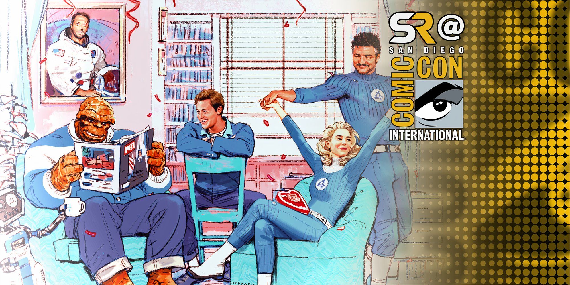
You’ve got Pedro Pascal as Reed Richards, Vanessa Kirby as Sue Storm, Joseph Quinn as Johnny, and Ebon Moss-Bachrach as Ben Grimm. That’s a powerhouse cast. The logo has to be strong enough to stand next to those names. When it pops up on the screen during the opening credits, it needs to evoke a sense of "Oh, this is going to be different."
Comparing it to the 2015 "Fant4stic" disaster
Remember the 2015 logo? It was dark. Gritty. The "4" was barely there. It looked like a logo for a security firm or a brand of tactical flashlights. It reflected a movie that was ashamed to be a comic book movie.
The Fantastic Four First Steps logo is the opposite. It’s proud. It’s almost "campy" in its commitment to the 60s vibe, but it’s executed with such high-end design principles that it avoids looking cheap. It embraces the "Fantastic" part of the name. If the 2015 logo was a dark alleyway, the 2026 logo is a bright, sunlit laboratory.
What this means for the future of the MCU
This isn't just a standalone branding exercise. This logo will eventually have to sit next to the Avengers logo in whatever Secret Wars film comes next. The contrast is going to be fascinating. Imagine the vibrant, retro-futuristic 4 clashing with the modern, high-tech 'A' of the Avengers. It sets the stage for a "fish out of water" story where the FF are the ones who are out of time—or perhaps out of universe.
The logo is also a massive hint toward the soundtrack. You can’t have a logo that looks like that and then play generic orchestral swells. You need jazz. You need bossa nova. You need something that sounds like Michael Giacchino having a blast with a 1960s big band.
Actionable insights for the hardcore fans
If you're looking to keep up with how this branding evolves, here is what you actually need to do. First, stop looking at the grainy leaks from filming in the UK and start looking at the official Marvel social media banners. They’ve been subtly updating the texture of the logo—adding slight "film grain" and "offset printing" effects that suggest the movie might even be shot on 35mm or 65mm film to match the era.
Second, watch the merchandise. Disney is leaning heavily into the "lifestyle" aspect of this branding. We're seeing apparel that looks like vintage NASA gear. If you want to understand the vibe of the movie, buy the merch. It’s the most direct line to the production's intent.
Lastly, pay attention to the blue. In the world of color theory, this specific shade of blue represents trust, intelligence, and communication. It’s the antithesis of the red-and-black "danger" colors we see with villains. The Fantastic Four First Steps logo is designed to make you feel safe. It’s designed to make you feel like the smartest people in the room are finally here to fix things.
Final takeaways on the new era
The transition from a simple "Fantastic Four" title to "First Steps" with this specific Googie-style branding is a masterclass in visual storytelling. It tells us the "when," the "where," and the "how it feels" before a single trailer has even dropped. It’s optimistic. It’s bright. It’s a much-needed reset for a franchise that has spent too much time in the dark.
- Monitor official Disney+ assets: The animated versions of the logo usually contain sound cues (like static or radio chirps) that hint at the technology level of the film.
- Look for the "Circle 4" on set photos: If you see this logo on the side of a spacecraft or a lab coat, it confirms the team is an established entity in their own world.
- Study the 1960s space race posters: The font used in the logo is almost an exact match for several mid-century aerospace advertisements.
This logo is more than just a marketing tool. It’s a mission statement. Marvel is betting big that we want to go back to the future, and if the design is any indication, it’s going to be a wild, retro ride.